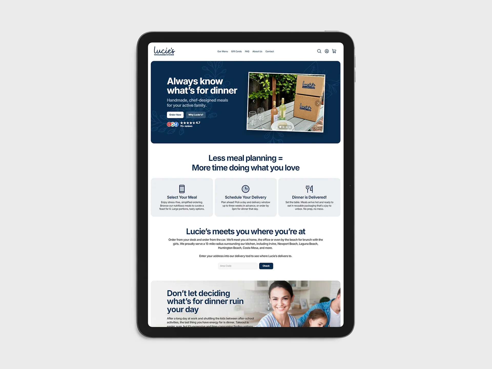
Homemade Meals Deserved a Homemade Brand
Lucie's delivered hot, homemade meals to busy families across Costa Mesa, and they built a loyal following fast. Orange County parents who didn't have time to cook but refused to settle for fast food.
I spent nearly two years building out their visual identity from scratch. The first thing I made was a style guide, and every asset that followed (print, digital, social) traced back to it. That discipline is what kept everything feeling like one brand, even as the output piled up.
The look we landed on was a dark blue, pale pink, and soft florals. It had to feel like a home kitchen, not a meal-prep startup. Warm and honest. Something a working mom would trust showing up at her door.
Two years of creative control meant I got to build the full picture:
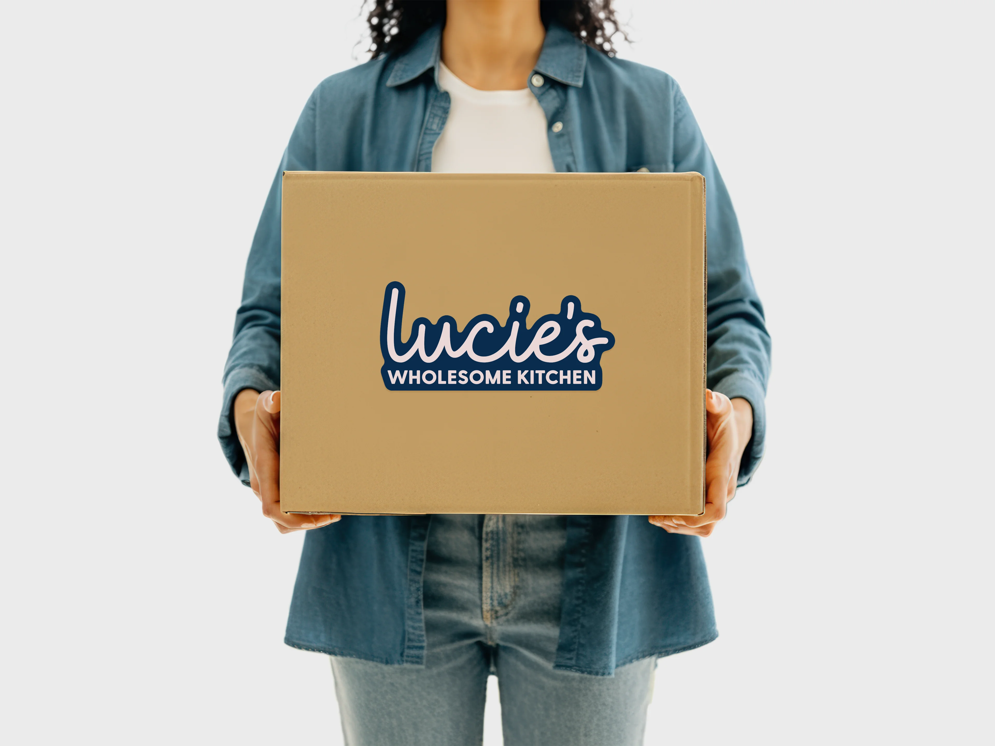
- Brand Identity: Logo system, custom patterns, style guide.
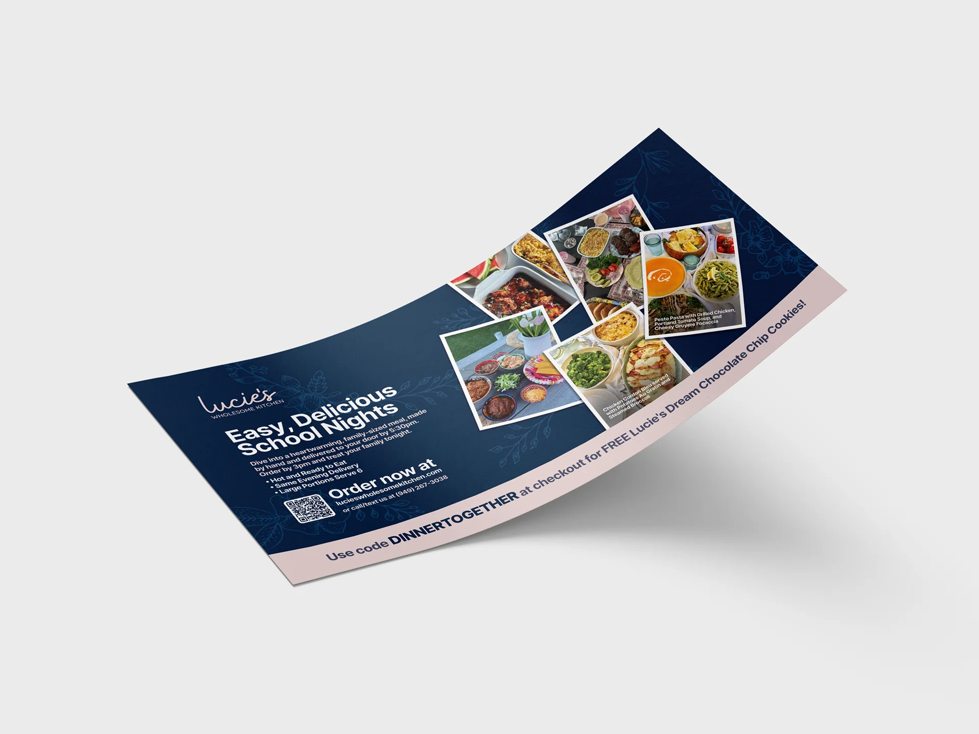
- Print: Direct mailers, flyers, posters, sticker sets.
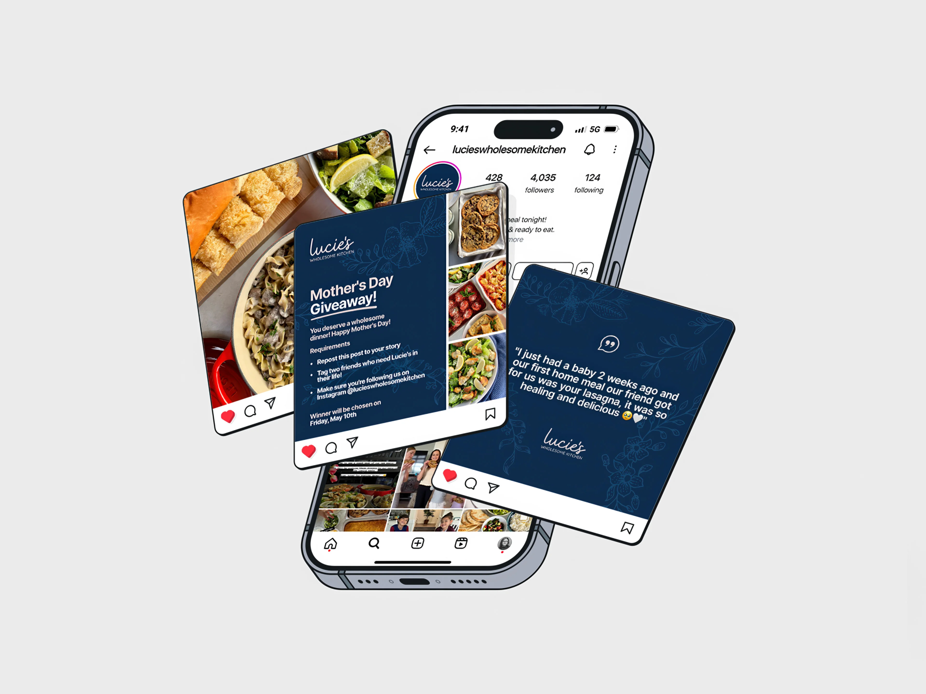
- Digital: Social content, email campaigns, web graphics.
Lucie's closed at the end of 2024. Internal reasons, nothing to do with the business itself. I'm still proud of this one. It's the longest partnership in my portfolio and the best proof I have that a considered identity can turn a small local brand into something people genuinely care about.