Making a Non-Profit Look Worth Funding
Greeley Creative District supports local arts and creative businesses in Greeley, Colorado. They run events, fund projects, and advocate for the creative economy in the region. The work they do is serious. The brand they were doing it with wasn't keeping up.
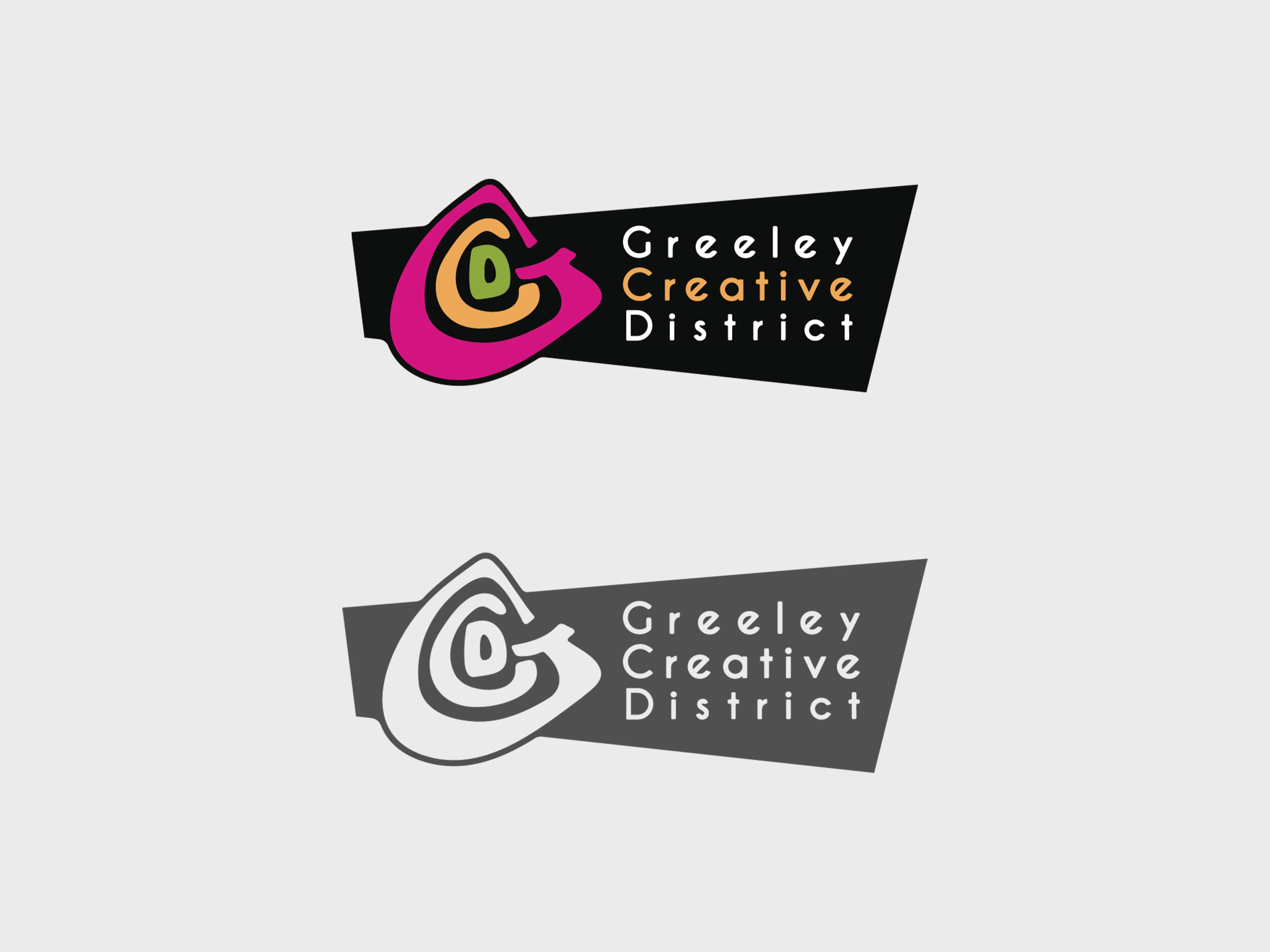
The logo already existed, but only as an older raster file. It needed to become a proper vector and get different lockups for different contexts. I kept the same general mark and color energy, then built everything else around it: a new color palette, typeface pairings, supporting graphics, and a set of guidelines that gave the whole thing structure.
Non-profits have a specific problem with brand consistency. Lots of people on the team need to produce materials, and most of them aren't designers. If the guidelines are too vague or too complicated, things drift. So I built the system to be usable. Clear rules, practical examples, enough flexibility to cover different use cases without opening the door to off-brand work.
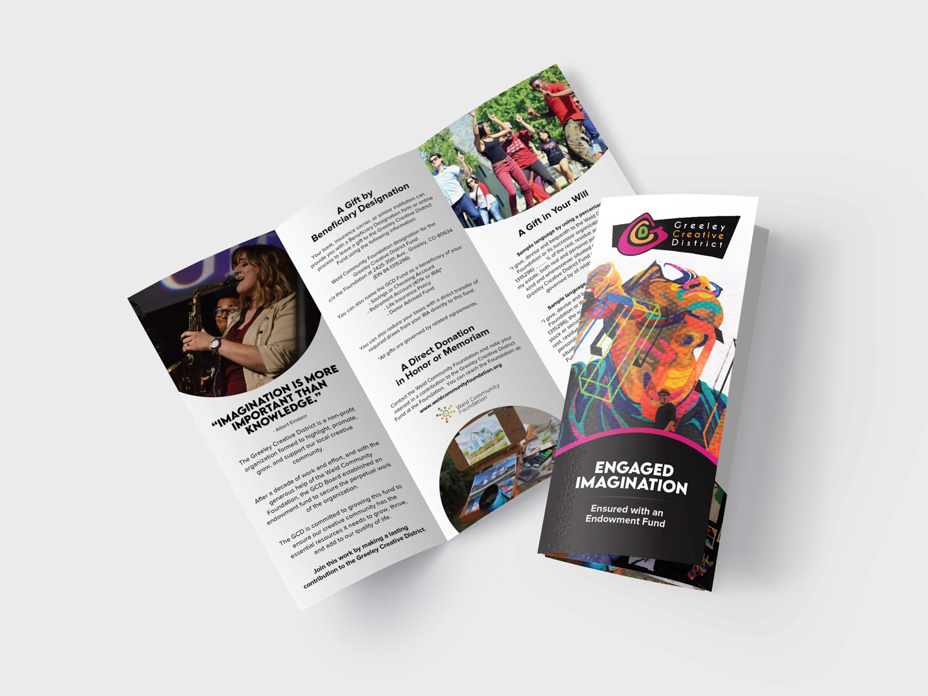
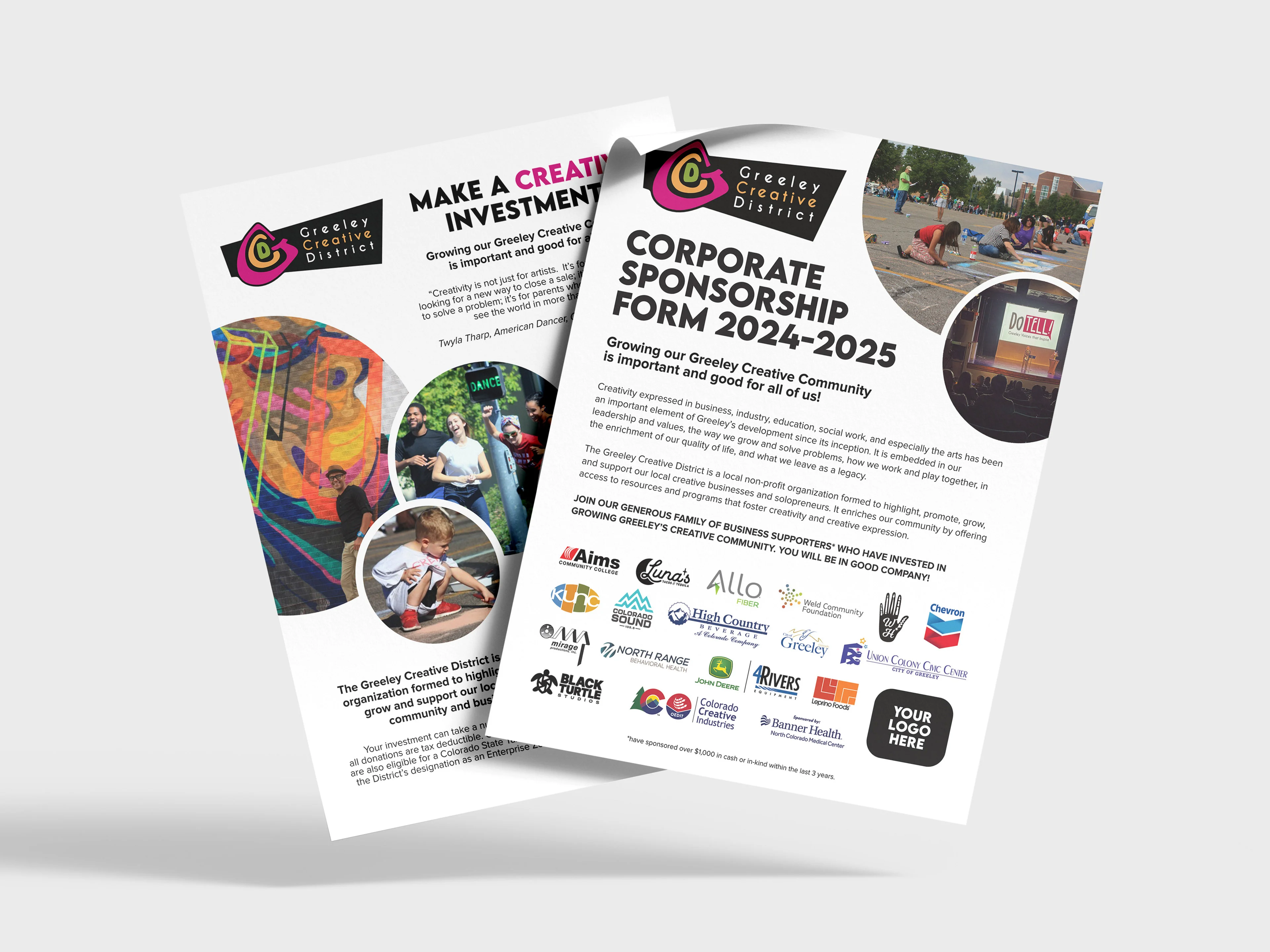
The biggest deliverable was the print campaign for their 2024–2025 fundraising season. When you're asking people for money, how you look matters. The materials needed to feel professional and credible without losing the warmth that makes a community arts organization feel approachable. That balance drove most of the design decisions.
What I delivered:
- Logo Refresh: Vectorized the original mark and created scalable lockups.
- Brand System: Color, type, and graphic elements built around the updated logo.
- Guidelines: A practical document the team could follow without design experience.
- Fundraising Campaign: Print materials for their 2024–2025 donor outreach.