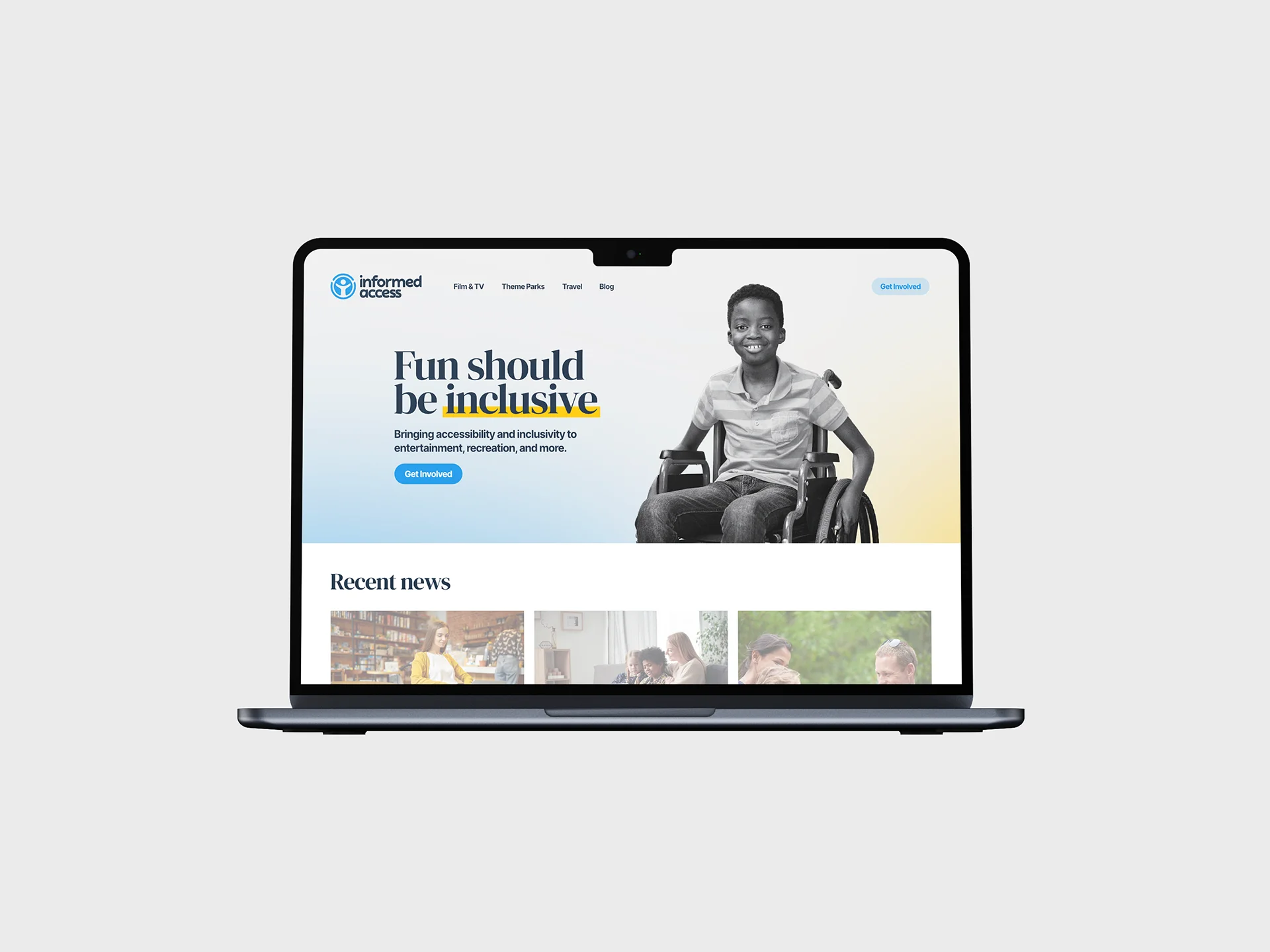
Informed Access is a personal project: a guide to accessibility information for entertainment, travel, and recreation, written for people with disabilities who want to know what to expect before they go. It's not finished, but the identity is far enough along to show.
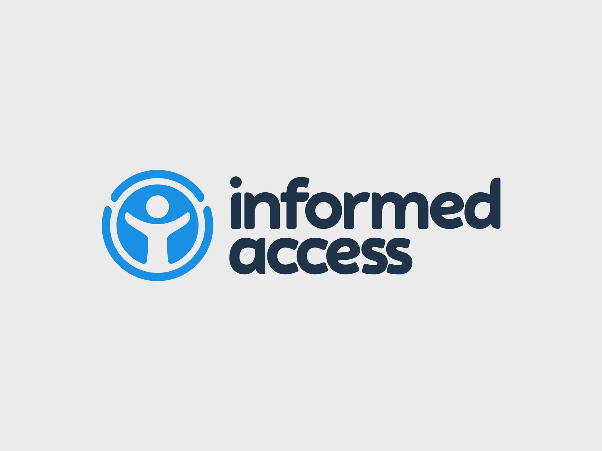
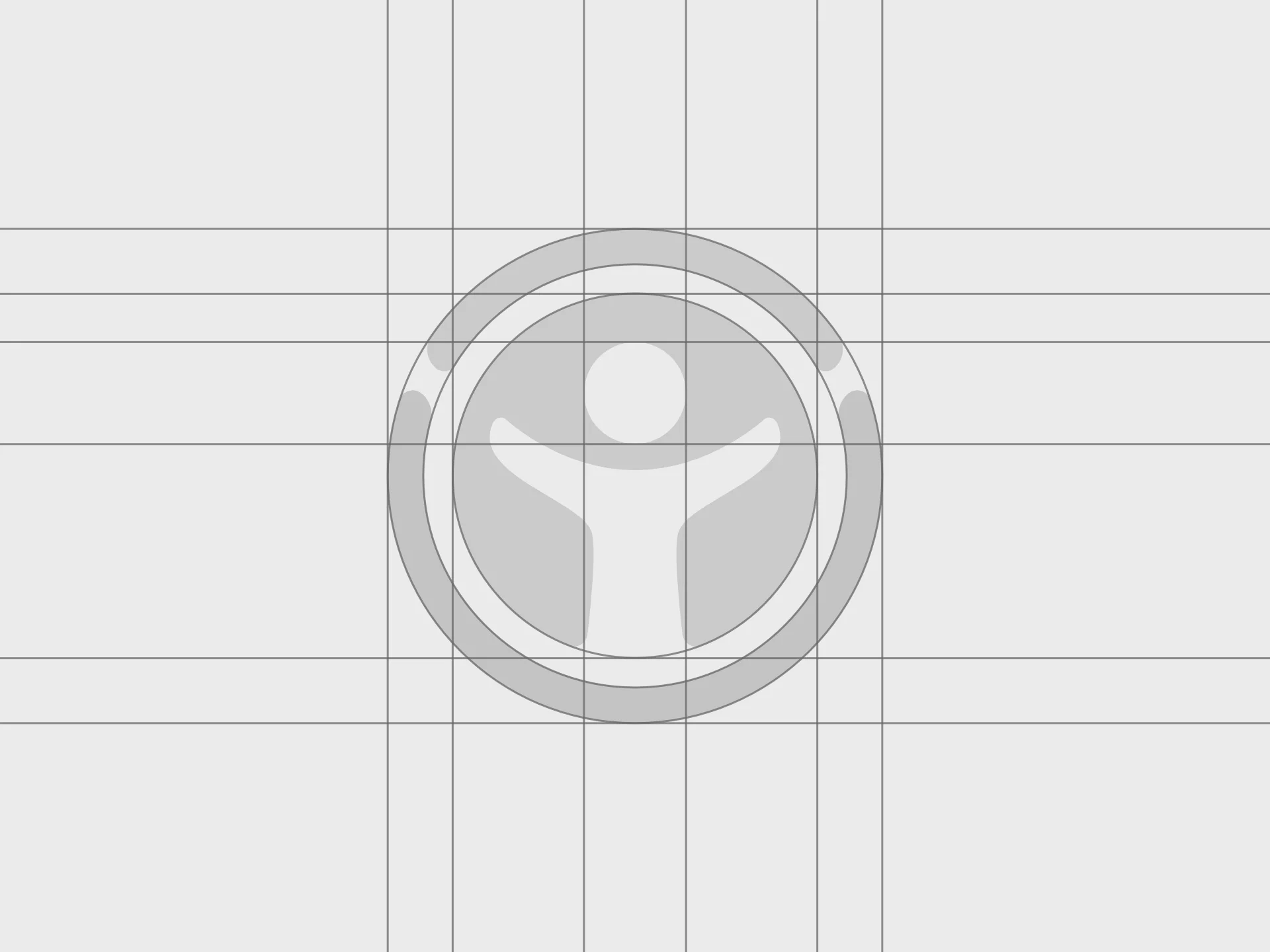
The logo starts from the standard accessibility icon and softens it: rounder, warmer, less institutional. Look closely and there's an eye in the negative space of the figure. The project is about helping people see what's ahead, and I wanted the mark to carry that without shouting it.
More to come once the site itself is further along.